
Arctic Scoops
Client
projects
Services
2024
Arctic Scoops is a new ice cream brand that offers a unique and interactive ice cream experience. Their concept is centered around self-serve frozen fruit and ice cream machines, allowing customers to create their own customized treats by choosing from a variety of flavors, toppings, and mix-ins. Arctic Scoops prides itself on using high-quality ingredients and promoting healthy options with their low-fat and sugar-free frozen fruit selections. With a modern and minimalistic atmosphere, Arctic Scoops has become a favorite for families, friends, and ice cream lovers alike.

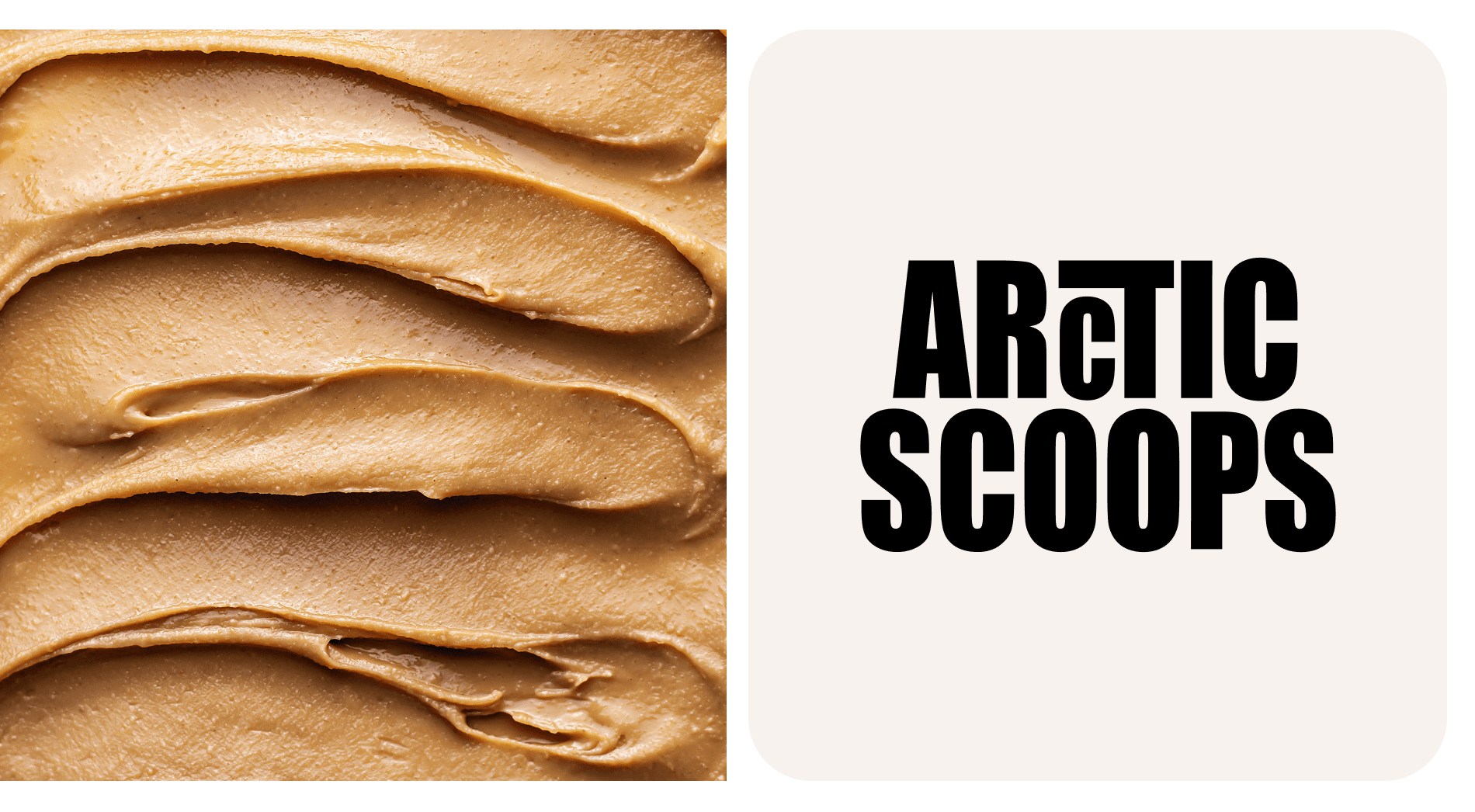


For the branding of Arctic Scoops, we proposed a sleek and modern design concept in black and beige colors. The logo features a stylized mininalistic and the brand's commitment to using high-quality, fresh ingredients. The typography will be clean and bold, with the brand name "Arctic Scoops" in uppercase letters. The color scheme of black and beige will create a sophisticated and timeless look, while also evoking a sense of coldness and freshness, reminiscent of the Arctic. The packaging will feature minimalist designs with white backgrounds and different icons from the various ice cream flavors. Overall, this design concept will convey a sense of luxury, innovation, and sustainability, making Arctic Scoops stand out in a crowded market.
Client Arctic Scoops Year 2024 Services Branding, Campaign Credits Yuliia Hrabynska
Hungry for more?