Candy Safari
Client
projects
Services
2024
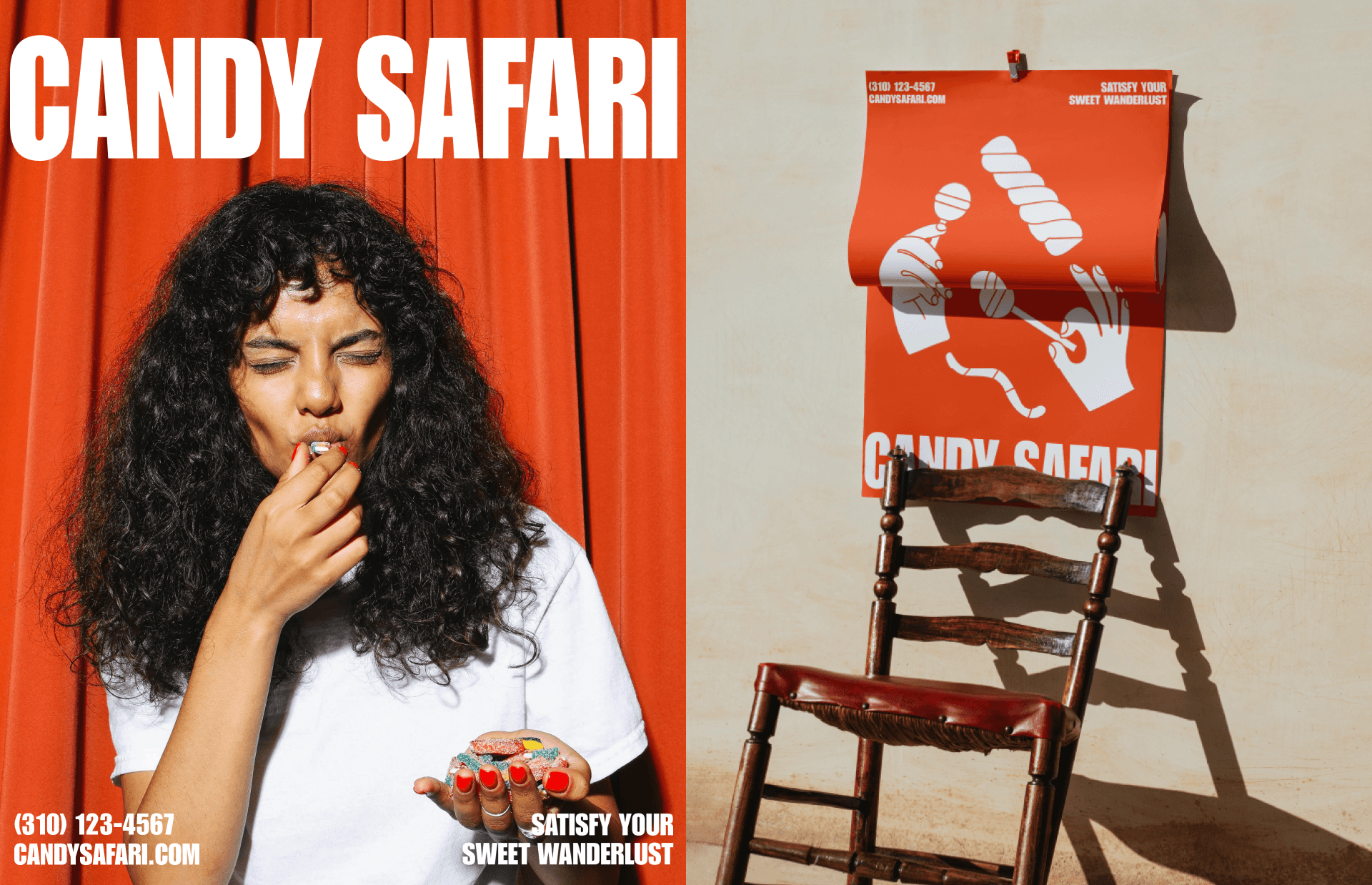
The Candy Safari candy brand design concept revolves around a bold, modern, and stylish theme, primarily featuring the vibrant colors of orange and white. The visual identity incorporates playful, geometric shapes reminiscent of candies, while maintaining a sophisticated aesthetic.

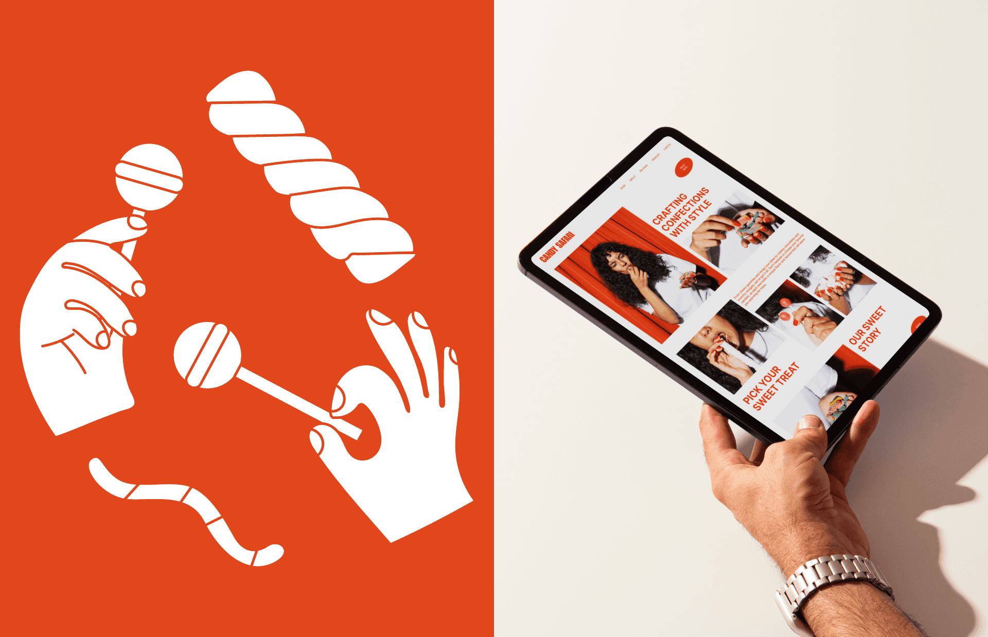


The orange serves as the dominant color, representing sweetness and energy, contrasted by the clean and fresh white, symbolizing purity and simplicity. The brand logo is designed with a unique typography, combining both colors and showcasing a sense of adventure and excitement, inviting customers to embark on a delightful journey through the world of Candy Safari.
Client Candy Safari Year 2024 Services Branding, Campaign Credits Yuliia Hrabynska
Hungry for more?